
React is a great tool for every developer who knows HTML and wants to create more structured and dynamic websites that are also more flexible and speedier. One of the primary advantages of utilizing React JS is the ability to reuse components. It saves developers a lot of time when it comes to code reusability. Tailwind CSS is popular among developers these days since it is a utility-first framework. By utilizing Tailwind, we don’t have to write as much custom CSS, which improves the readability and speed of development. We can quickly create a responsive and functional web page.
As INFYNNO produce numerous websites in React with Tailwind CSS, we came up with the concept of creating a website where any user may receive the dynamic code of their required component. We created all of the components using only react and tailwind CSS, with no additional packages. Let’s talk about each responsive component-making journey and how much we can save time. UI elements that are beautifully made with Tailwind CSS at Tailwind Blocks Infynno
Application UI
We differentiate our website into sections so the first is application UI. In that, we mention pricing layout, carousel component, credit card layout, etc.

1) Pricing Layout
The pricing components show you different varieties of price comparison because now a day it was a tendency to compare plans and choose one out of variety.
There are many varieties of pricing we provide to you like table type, with effects, without effects, static, two pricing comparisons, three pricing comparisons, with free section, etc.
In pricing sample 2 we show the beautiful translate effects and color change on hover we used react’s single useState to manage all things we change the color and also change the SVG images on hover. In pricing sample 4 we show 2 options of pricing using JSON and also give a free trial section below. Pricing sample 5 is somehow interesting because we follow table structure and 4 object array JSON, we used the single map to iterate over the whole responsive design.
2) Credit Card Layout
Most websites or apps need card payment options nowadays, so for user and developer comfort, we design some cards with attractive UI and animations. In card components, you have to pass card no, CVV, validity date, and name in UI, and when you click save you got your all data In the console. It makes it easy to directly call API. In the card, we also validate the data which you enter If you enter anything wrong it is through error. I also want to inform users we haven’t used any external package for animation, UI, and validation.
3) Carousel
Carousal is used when we want to show a more detailed view of things using images. Clarity is the first point of trust. To win customer’s belief carousel took an important role. Here we made a responsive carousel without using any external packages. The first carousel is the simplest one only for working with 3 – 4 images. Carousel component 2 is something special one, because the features like an infinite loop, a custom dot at the bottom, and custom text can change when sliding, also we pass animation inside it.
Form Elements
Form Elements are the foundation of any form, we add serval form elements to make user convenient experience. below are mentioned some of the form elements.
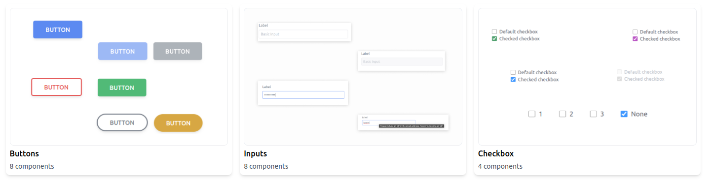
1) Buttons
The button is as important in any website as functions in javascript, useState in react, and class in a tailwind. Here we made multiple variants of buttons we have a default blue button, colorful button, rounded buttons, big and small buttons, full-width buttons, fill button, outline button, etc. Most designers want customization so just copy the code and change it as per needs we mention comments for each view of the button so that without any confusion anyone can use it.
2) Inputs
Inputs are useful when we want to get value from the user. There are many ways to enter input type attributes like text, number, mail, password, etc… By using the type attribute it adds by default restriction and gives a message if we enter a value out of scope.
3) Radio Buttons
When we want to select one from many options radio buttons are the appropriate choice. We made variants of the radio button like checked, inline, simple with hover effects, etc… Must care of the id of input and label value same for one radio input and the name of input is changed for the different fields when making multiple radio options
4) Checkbox
The checkbox is used when multiple values want to select from limited options. We have many approaches in the checkbox default, disable, colorful, inline, etc…
Conclusion
We hope this blog is useful to you and We use tailwind and react to implement the things we have built, but the process never ends. We update our site consistently every day, so if you stick with us, we’ll make your hour’s work go by in a matter of minutes.
Please share this blog with your friends if you enjoy it. By doing so, we might be able to assist him. Click here to visit our website.
With the help of Figma, our team of 35+ engineers produced more than 25+ projects that were then translated into responsive code for react/next and tailwind CSS.
Infynno understands the dreams of our clients and provides a realistic view of their thoughts and startups.
Get in contact with us to discuss any business ideas or ambitions you may have, and we’ll give them wings for your future.